Module 2 – Final Quiz
Time limit: 0
Quiz Summary
0 of 1 Questions completed
Questions:
Information
You have already completed the quiz before. Hence you can not start it again.
Quiz is loading…
You must sign in or sign up to start the quiz.
You must first complete the following:
Results
Quiz complete. Results are being recorded.
Results
0 of 1 Questions answered correctly
Your time:
Time has elapsed
You have reached 0 of 0 point(s), (0)
Earned Point(s): 0 of 0, (0)
0 Essay(s) Pending (Possible Point(s): 0)
Categories
- Not categorized 0%
- 1
- Current
- Review
- Answered
- Correct
- Incorrect
-
Question 1 of 1
1. Question
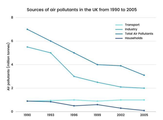
The graph below shows different sources of air pollutants in the UK from 1990 to 2005. Summarize the information by selecting and reporting the main features, and make comparisons where relevant.
Write at least 150 words.

-
This response will be reviewed and graded after submission.
Grading can be reviewed and adjusted.Grading can be reviewed and adjusted. -
