
Interpreting IELTS Pie Charts
Interpreting IELTS Pie Charts
In IELTS Writing Task 1 of the Academic type, one of the question types is Pie charts that can be used to show visual data. IELTS Pie charts are circular graphs separated into sectors or “pie slices”, which typically depict percentages.
The size of each pie slice signifies the relative amount of data it represents. The slices form a complete circle when joined together.
Let’s see an example of how to answer a basic pie chart.
From the above given IELTS Task pie chart, we can answer the following questions:
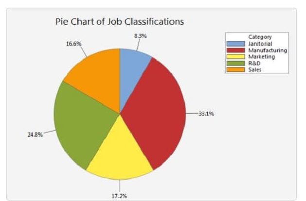
1. What is the largest proportion of jobs?
Manufacturing
2. What is the smallest proportion of jobs?
Janitorial