
Multi Line Graph Example 1
Multi Line Graph Example 1
Definition: They are commonly used for comparison. These types of graphs have more than one line. ( on the same axis).
You should spend about 20 minutes on this task.
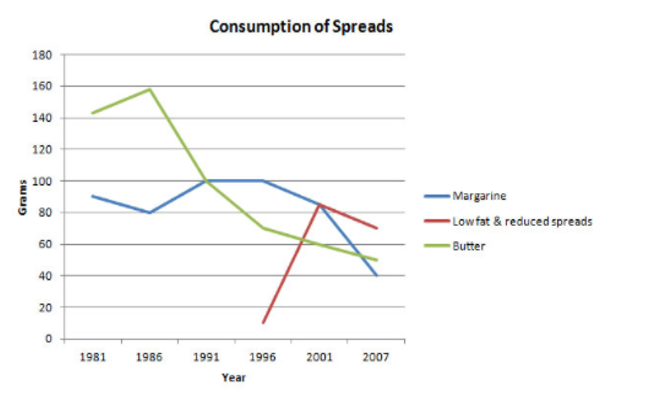
The graph below shows the consumption of 3 spreads from 1981 to 2007.
Summarize the information by selecting and reporting the main features, and make comparisons where relevant.
Write at least 150 words.
Sample Answer
The graph portrays the consumption of three kinds of spread, namely, Margarine, Low Fat and reduced spreads and butter, over 26 years, from 1981 to 2007.
It is evident that butter and margarine were the primary spreads used until the introduction of low-fat and reduced spreads.
The staple spread from the early 1980s till the early 1990s was butter. The consumption of margarine followed a fluctuating trend over the years, from 1981 to 1986. The consumption decreased but then rose till 1991 and remained stagnant till 1996 after which it started declining. The use of low-fat and reduced spread began from 1996 and rose sharply from the first year till 2001 after which its preference decreased.
With regards to quantity, butter peaked at about 160 grams after which it followed a downward trend. The quantity of Margarine was within 80-100 grams for 20 years till 2001 after which it fell to 40 grams in 2007. The number of low-fat spreads crossed 80 grams in 2001 after which its consumption quantity fell.