
Pie Chart Example 1
Pie Chart Example 1
Now that you have an idea about pie charts, let us look at some examples with sample answers.
Report Plan
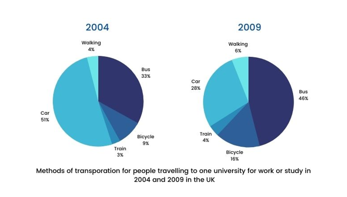
The chart shows the main methods of transportation for people traveling to a university for work or study in 2004 and 2009. Summarize the information by selecting and reporting the main features and make comparisons wherever relevant.
Sample Answer
The pie charts depict the proportion of travelers using five different modes of transportation to commute to a university for work and study purposes in 2004 and 2009.
We can observe from the pie-charts that the ratio of people commuting by cars significantly decreased from the year 2004 to 2009 while the other modes of transportation witnessed an upward trend.
Over half of the people (51%) in 2004 traveled by car followed by bus which recorded a ratio of 33%. It is apparent that only 9% of people used bicycles to commute to university which was about three times the ratio of commuters who used the train. Meanwhile, 4% of the people preferred to walk to go to the university.
The proportion of bus-based travelers rose significantly by 13% as a new bus stop was introduced at the university in 2006. Further, some modifications were made to the car parking in 2008 at the university which led to the ratio of car travelers dwindling to 28%.
In contrast, the percentage of bicyclists witnessed a substantial rise by 7% along with the train passengers and pedestrians proportion which followed an upward trend to 4% and 6% respectively.