
Pie Chart Example 2
Pie Chart Example 2
Report Plan
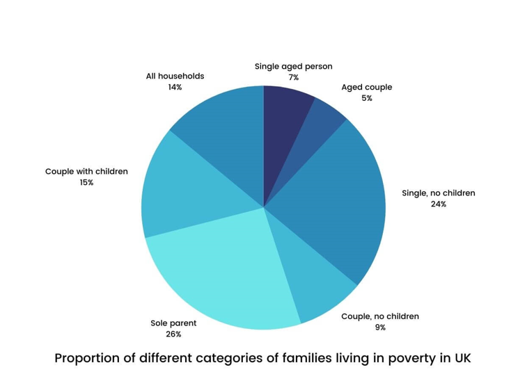
The pie chart below shows the proportion of different categories of families living in poverty in the UK in 2002.
Summarize the information by selecting and reporting the main features, and make comparisons where relevant.
Sample Answer
The pie chart inspects the different family types living in poor conditions in the UK in 2002.
At a glance, in the given year, 14% of the entire households in the country were in circumstances of poverty. In comparison to the couples, singles struggled more. Talking about people with children, single parents presented the maximum percentage of 26% amongst all the specified categories, whereas couples with children reported a comparatively lesser percentage of 15%.
As far as the people with no children are concerned, single people were of the hefty percentage, 24%, almost the same number for single people with children. On the contrary, merely 9% of the couples without any children agonized from poverty in 2002. Coming to aged people, singles had a somewhat higher percentage in comparison to couples. Only 7% and 5% of the aged population had difficulties in their living.