
Simple Line Graph Example 1
Simple Line Graph
You should spend about 20 minutes on this task.
Write a report for a university lecturer describing the information in the graph below.
Summarize the information by selecting and reporting the main features, and make comparisons where relevant.
Write at least 150 words.
Sample Answer
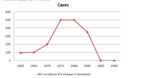
The given image depicts a line graph representing the trend in the occurrence of X disease in Someland from 1960 to 1995.
The line graph represents the presence of X disease in Someland in varying numbers at different time intervals until it is wiped out entirely from the place.
It is clear from the line graph that the number of people affected by X disease did not cross 100 between 1960 -1965. The number of affected individuals began rising after the year 1965 and reached 200 in 1970 and 500 in 1975 respectively. The occurrence of X disease remained stagnant between 1975-1980 at 500 affected individuals. After the year 1980, the number of cases took a downward trend, falling down to almost 350 in 1985 before being completely eradicated by the year 1990. The number of people affected by X disease in Someland has been zero from 1990 till 1995.